


Friday, August 18, 2006
life on the grid: fine-tuning the layout
I'm currently at work on release 3 of the Template Object Model. My goal is to impose as much symmetry upon the layout as possible using only basic css and avoiding as much as possible complicated hacks and workarounds.
My success can be tracked on the moshi profile.
Looking over the latest version myself, I see I've done a pretty good job. It looks better in Firefox, but it looks good enough in IE -- which as far as my self-imposed mandate goes.
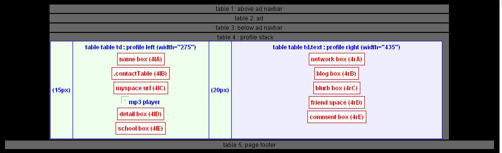
One thing tying me in knots is that left-most filler cell in the main profile table (Table 4 according to the TOM.)
Originally, I had it styled to match the body background (Believe I adopted that from the mikeindustries stylesheet.) Under my new basic-css regime, however, I want it to match the left half of the profile, which means styling the basic table td cell to the color of the left half of the profile (table table td) like so:
With the current style sheet, this also changes the color of the footer table (Table 5), so we have to restyle that further down to match the body background color, like so:
I've almost got the main right-side content blocks lined up and equal in width. Need to add a little padding to the left-side blocks. Once that's done, we'll be at version 0.6: the symmetrical BET-scan.
My success can be tracked on the moshi profile.
Looking over the latest version myself, I see I've done a pretty good job. It looks better in Firefox, but it looks good enough in IE -- which as far as my self-imposed mandate goes.
One thing tying me in knots is that left-most filler cell in the main profile table (Table 4 according to the TOM.)
Originally, I had it styled to match the body background (Believe I adopted that from the mikeindustries stylesheet.) Under my new basic-css regime, however, I want it to match the left half of the profile, which means styling the basic table td cell to the color of the left half of the profile (table table td) like so:
TOM { PROFILE TABLE... left margin - match with table^2 td below }
table td { background-color:eeffee; border-width: 0px; font-size:12px; }
table td { background-color:eeffee; border-width: 0px; font-size:12px; }
With the current style sheet, this also changes the color of the footer table (Table 5), so we have to restyle that further down to match the body background color, like so:
TOM { FOOTER LOWER HALF - match with body }
table div { background:black; }
table div { background:black; }
I've almost got the main right-side content blocks lined up and equal in width. Need to add a little padding to the left-side blocks. Once that's done, we'll be at version 0.6: the symmetrical BET-scan.
